Welcome Agency
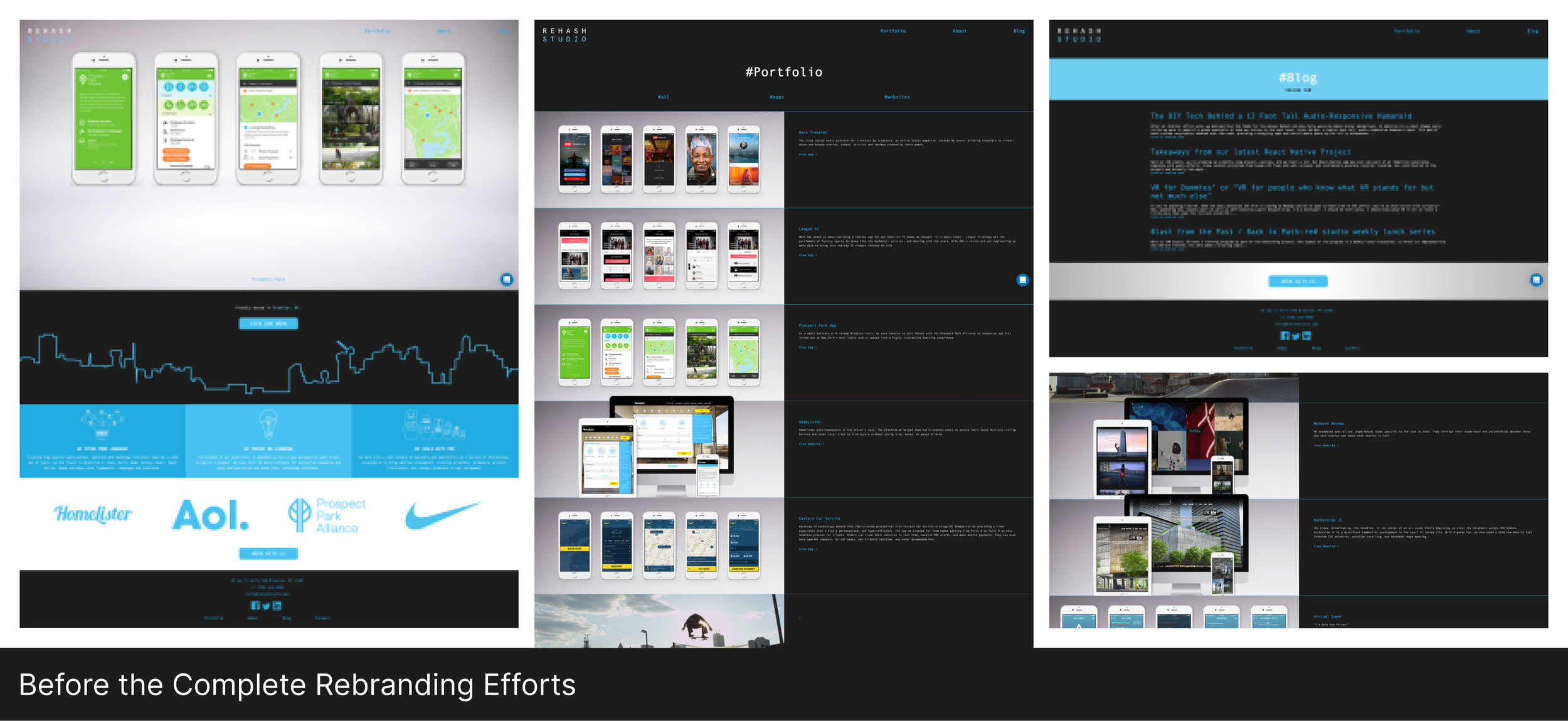
Welcome Agency is a design and development studio in Brooklyn NY. They used to be called ReHash Studio and then decided it was time to rebrand and position themselves based on all the super cool projects they’ve worked on over the years. ReHash was looking for a complete rebrand from the ground up. Something that reflected who they are as a modern tech company - something that shows their company DNA, their phylosophy behind the work they do. They hired a branding expert to provide a style, tone, and a small-scale guideline (colors & style), so it allowed me to stay within these parameters as I still get to use the “open blue sky” approach.
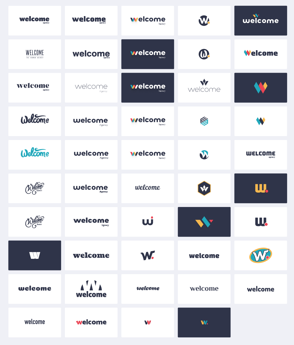
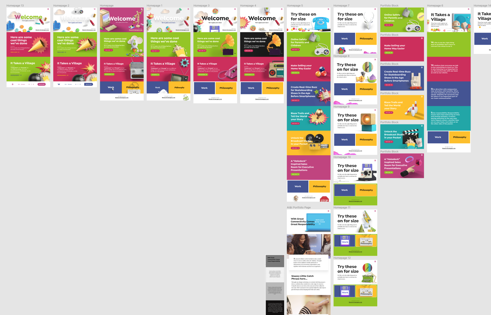
Once I’ve selected the two fonts that complimented each other we began the work. The evolution of the designs as you’ll see below is the outcome of about three different websites that we’ve decided to explore and eventually settled on one of them as the final site. The final site ended up being the one closest to the original brand guidelines, which are the last few screens below. You can see here in the first screen a little taste of what the original website looked and felt like. The rest from there are the explorations requested by the team. We went on the deep-end on this one and truly stretch our creativity just to see what we can create with the minimal guidelines given.
At first, we began the project with some wires, just so we had some understanding of the type of flow they wanted. From here, we went straight to high fidelity mockups and continued our iterations there. ReHash wanted the site to be welcoming (hence the name) and inviting while still playful, but yet simple/minimal. As we started, we explored first a modern and contemporary style while still staying with the small brand guide. We had to keep in mind the animations and all the little gestures that went into it as I designed each element. It was important to ReHash that we capture the beauty of what they’re really about and show the skills they have. The company is scrappy, smart, and just about hand-coded everything they do. They do a lot of really cool projects besides your typical mobile apps and websites - they are true innovators. So I had to make sure this was reflected in my design work. For this one, we included a “get proposal” button, so that visitors can fill-out a quick form of what type of project they’re looking to get done. This had to be a seamless and simple experience.
On another round, they expressed something that had a sort of retro nostalgia while staying within brand parameters. As you go through each pages, you start to see the radical evolution of the site from what it originally was to where we ended up. This request had allowed them to see what the alternatives are when we start to sort of stretch the boundaries of the vision. After the third exploration, we decided to use real imagery for the projects instead of stock mockups, they did all the in-house photography for their portfolio, which really showed how they love originality. We knew this was the site and the final exploration that captured the essence that James (the CEO & Founder) had in mind. From the logo, the imagery/asset stylings, to the UI and UX, the site is pretty flawless. I really enjoyed working with these guys and gals. They are kindness met with innovation - a fantastic crew to work with.